Do I really need to get into Pantone brown?
Pantone came out with a new Color of the Year, and it’s Mocha Mousse. I’ll spare you the Pantone promotional image of mocha mousse arranged suggestively in its glass: you can take a look yourself by clicking the link. “Capturing a Global Mood of Connection, Comfort, and Harmony,” Pantone writes. I’ve recently taught a graduate class on pragmatics, a subdiscipline of linguistics that studies language in use. One of the first things we learn is the concept of implicature. Implicature is the action of implying a meaning that is not stated directly, but can be understood or gleaned from context. There is a lot of unspoken meaning one can glean from Pantone’s choice for 2025. I myself often delight in oblique language, but let’s be explicit: Pantone’s image for the global mood of connection, comfort, and harmony looks like a turd.
Do I really need to step into the Pantone pile?
On my main desk: my A6 journal, an antique brown box of unknown origin, and two brown pens: Kilk Yggdrasil (paired with Herbin Shogun) and Leonardo Momento Magico Bohemian Twilight (uninked). The menagerie friend on the left is a bear.
To be sure, brown is beautiful, and it can be an exquisite choice in design. I myself love the color. I love the the warmth of a well-polished wood, vintage weavings, corduroy, leather, old ceramics, a worn spine of a book. In Rose Tarlow’s Private House, polished dark woods are paired with crisp whites and a vivid, vital splash of green. I love that aesthetic, even though it’s not quite mine. In my own room, I keep an antique hand-carved box I found over a decade ago in the now-demolished Mission Road Antique Mall - a seller called Jill had it, and I bought it from her to give as a gift, but it has never left my desk. I keep washi tape and rubber stamps in it. It’s brown - a wonderful deep hue with color variations and geometrical designs. Every few years I give it a shine of Howard’s Feed and Wax, to bring out its luster and age. I have a carved figurine of a hunter I found somewhere, a long time ago, in a fruitwood, I think; a paler brown. I have a brown menagerie bird with curious turquoise eyes; there are hundreds of brown books on my shelves. I have enjoyed brown notebook covers, even a few brown pens.
None of them are “mocha mousse” - none of them are an unspoken, flaccid surrender to the political weight of the moment under a guise of a sweet. Pantone could have chosen any of the beautiful brown things for the name and the image. But they did not.
Look - maybe it means something different. Maybe it was tongue in cheek. Maybe it was defiant. Maybe they earnestly love this particular presentation of mousse. Implicature can only take you so far, but I cannot unsee the turd.
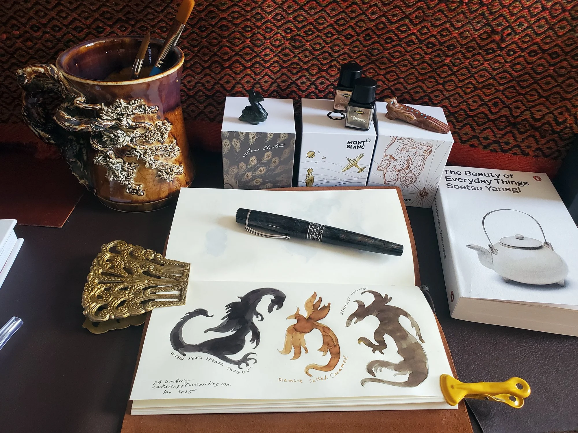
A brown desk scene with inks, books, art pottery, doodles, and my Kilk Yggdrasil fountain pen inked with Herbin Shogun. Menagerie friends are two birds: beadbird and roadrunner.
I don’t use brown ink on the regular, although that’s been changing slowly. I’ve enjoyed a few exquisite browns: Montblanc Robert Louis Stevenson, which I received as a birthday gift in 2023, has been a revelation to me. I was so sure I would not use it, but it’s wonderfully evocative: pirate maps and old paper, secrets of the kind I want to know. I’ve been inking it again and again in my Onoto Magna Keats. It’s taking a rest at the moment. Then there is Herbin’s exceptional Kenzo Takada Shogun. Is it black? Is it brown? What it is is magnificent - understated, elegant, its shimmer emerging like a line of poetry from the shadows. I have it inked in my Kilk Yggdrasil, a dark brown pen about a mythic tree that is always asleep and always awake: a winter tree which is not dead but gathering its promise, its roots deeper than time.
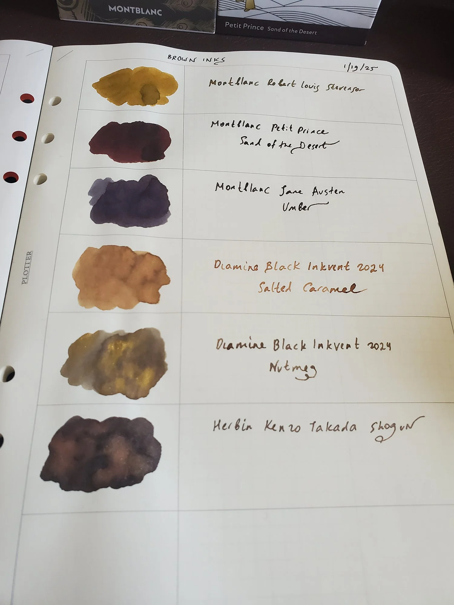
A few brown inks I am contemplating. The Montblancs in this picture are all labeled marron (brown), yet they could not be more different: Stevenson is faded map sepia, Sand of the Desert is a deep reddish brown hue, and Jane Austen Umber has a pronounced purple sensibility. The two Inkvent samples I got are brown, and I’m not sure when I’ll ink them, if at all - but they are nice to have for art. Shogun is inked regularly.
Jacques Herbin Shogun - closeup
There are many reasons to love brown, and even to revel in a fashion for brown which is coming down the road for us in 2025 thanks to Pantone and also, yes, inspired by a difficult global mood. There is no rush to either embrace or reject a color. Still, an increase of interest to an often neglected shade can be a chance to try something new. We’ll make our own meanings out of the palette we’re dealt.
Brown shimmer ink doodles - left to right, Herbin Shogun, Diamine Salted Caramel, Diamine Nutmeg.


