
Ink Review: Jacques Herbin Turquoise de Perse
I’ve recently acquired a bottle of the new Jacques Herbin ink, Turquise de Perse, as a present for myself for my birthday. I ordered it from Dromgoole’s - but you can find a bottle at many pen retailers. This ink review is not sponsored, and I am not affiliated with anyone - all opinions are mine alone.
Jacques Herbin, the company, was established in 1670; they began by making sealing wax, I believe. They changed course a bit and began making inks in 1798. That’s a lot of time to make inks. Some of the inks are sealed with fine wax in tribute to the company’s original focus on waxes. Each bottle is hand-dipped in wax. You can see the process in this instagram reel from Casa della Stilographica. This is exactly the kind of magic I want in my stationery - a long story, a touch of human hands, a gorgeous color and packaging to create a feeling of wonder removed from the violent and increasingly automated and dehumanizing screech of the present.
I own four Herbin inks, all four of them shimmers. My very first acquisition of non-black ink was Émeraude de Chivor, a lustrously jeweled emerald green I’ve since archived, but which I still keep out of fondness; a bottle of Kenzo Takada Shogun, an understated, sophisticated ink I tend to reach for in early winter; a bottle of Vert Atlantide, a newer addition after I finished some samples of it, and which deserves its own writeup; and now, the fourth one, Turquoise de Perse.

Four Herbin shimmers, left to right: Émeraude de Chivor, Kenzo Takada Shogun, Vert Atlantide, and Turquoise de Perse. The Kenzo Takada ink does not have a wax cap, and that has bothered me a bit. I've even considered applying wax to it myself, and might yet do just that.
Turquoise de Perse is an ink in the 1670 series, a blue-green hue with marvelous gold shimmer, reminiscent of the turquoise which is mined in Iran since antiquity; Jacques Herbin is said to have visited Persia on the way back from India. I am fond of turquoise, and this color made me happy when I saw it online; from the moment it was announced, I knew I wanted to get it, and in fact, I preordered it.

Inky spread with my palette in the Plotter A5 Chart Grid, the Leonardo Momento Magico pen, and menagerie friends beadcat and alabaster rabbit.
I’ve inked Turquoise de Perse in my Leonardo Momento Magico Bohemian Twilight with a Franklin Christoph steel M SIG nib. It’s one of the three turquoise inks I have inked in right now, which does not feel very seasonal at first glance, but actually pairs brilliantly with autumnal oranges and browns. I’ve been loving this ink. There’s something elegant and storied about it, and yet it feels so joyful.

Trying out the ink in my Hobonichi blank insert.
There is plenty of lovely shading and gold shimmer; I am not seeing much, if any, sheen in this ink. The flow is quite wet and nicely lubricated. It is not a fast drying ink, but it dries reasonably well for a shimmer - in my M SIG nib on Tomoe Sanzen, the ink was dry somewhere between 30 and 35 seconds (on control test, the 30 seconds was still a tiny bit smudgy). Your exact drying time will vary depending on paper and nib size.
I’ve experienced this ink as lustrous, appropriate for any season and a pick me up in autumnal gloom. It would pair well with a dark, mysterious brown and a cheery orange or red in a currently inked palette.

Art setup - I decanted some of the ink using a syringe. I think I did not shake the bottle well enough, or some of the shimmer sank to the bottom of my dish, because there wasn't as much shimmer to work with. :)
In honor of Iranian mythology, I drew and inked a Simurgh for today’s inky mythical creature doodle. The Simurgh often appears with a head of a dog, or sometimes with a human face, but I like the historically drawn beaky heads the best. :) Painted in my Travelers on a Midori insert.
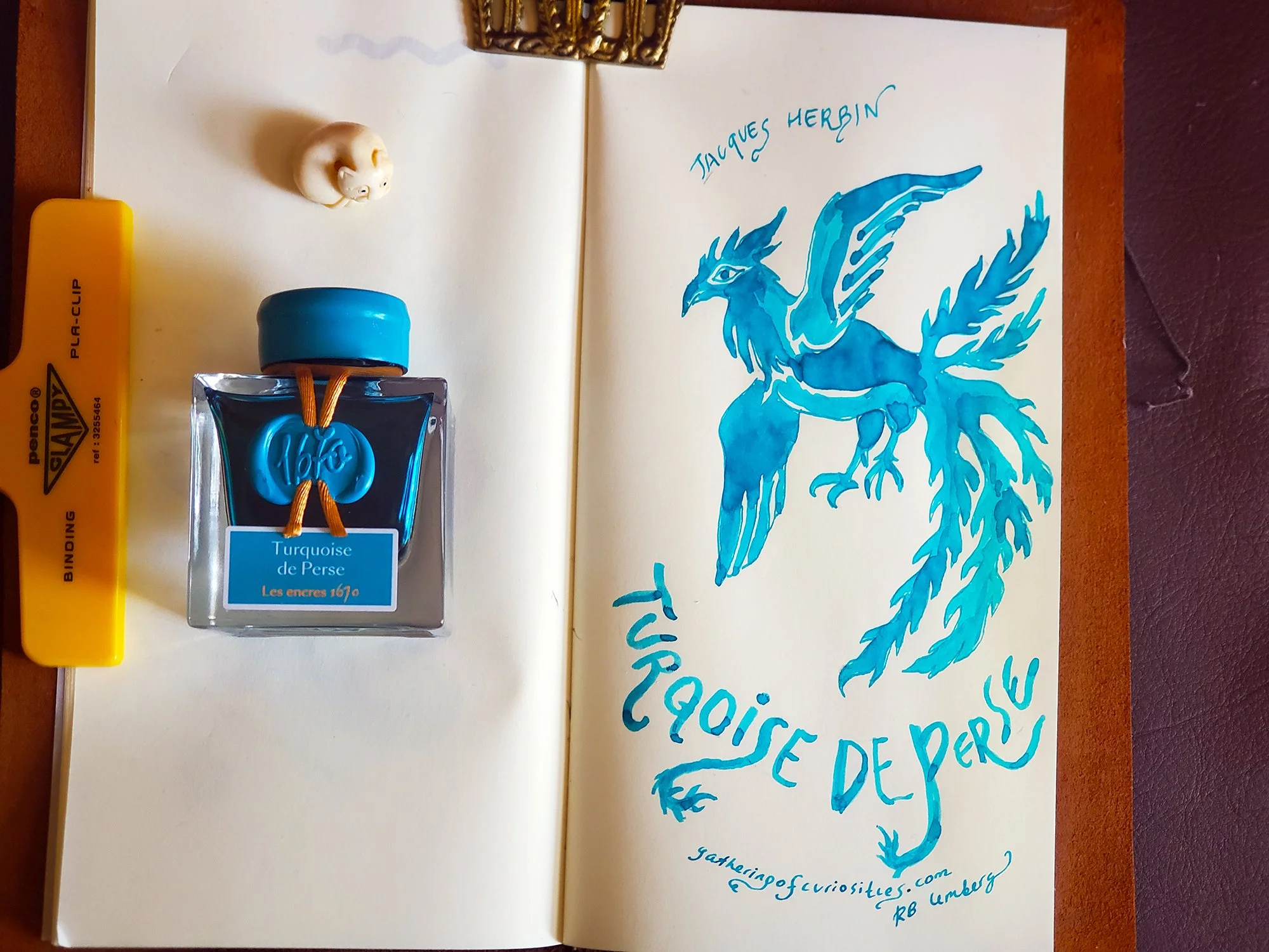
Simurgh inky drawing in my Travelers journal with a Midori insert.

Simurgh closeup :)