Ink Thoughts: Montblanc Dragon Red
I’m fond of Montblanc inks - they often hit the sweet spot for me with the combination of great ink quality, shading and saturated colors, beautiful packaging, and story. The inks are expensive, but I don’t buy all that much ink, so it’s a reasonable indulgence in my life. That said, I have been frustrated about Montblanc inks since Montblancgate - as I’ve written before, the story is an essential component of enjoyment for me, and repackaged ink duplicates ruin that. I wish this wasn’t a thing.
Onward. I love dragons - I’m a fantasy writer, and perhaps it comes with the territory. As an author I’m known for my fantastical birds, and birds and dragons share a kinship - dragons are birds of a kind, legends of a mythical age. I am fond of the Montblanc Zodiac series despite not having any in my collection (except for Scarlet Red, which is the same as Tiger Red), and so I was looking out for the Montblanc Dragon Red ink.
Of course, it went on sale through Montblanc Boutique for about five minutes, and then sold out. Which is another thing I detest. There is an emerging theme here.
Luckily for me, I have wonderful pen friends who are there to help with my ink wishes. Josh ordered some bottles via Montblanc Canada, and thanks to Jay, who shipped the inks, a bottle of Dragon Red joined my ink library today.
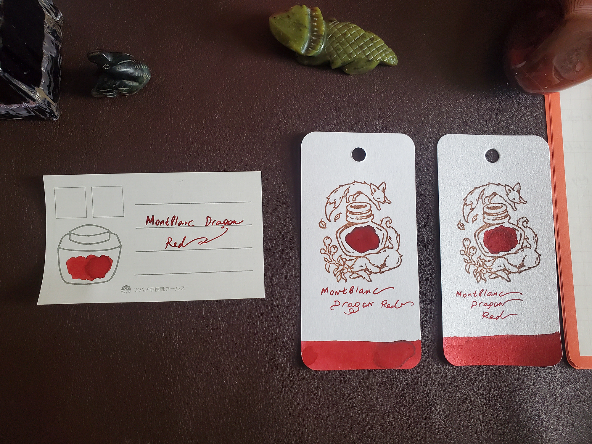
I was excited to meet this particular dragon! I decided to test the ink on different papers I use: Tomoe, Midori, and Plotter, as well as Col-O-Ring cards and the Tsubame ink collection cards. Here they are set out on my rolltop desk for swatching, accompanied by Menagerie friends beadbird and horned toad. (The Menagerie is my collection of animal figurines - I will write about it soon).
Ink, paper assortment, and small friends. The stamp for the Col-O-Ring cards is the delightful fox/dog one from Yoseka.
Swatching this ink was a delight - it is nice, flows well, seems to dry reasonably fast, shades beautifully… (I am not going to do drying time tests, sorry).
Just to be sure, I compared Dragon to other MB reds in my possession - Hadrian, Red Fox, and Scarlet, aka Relabeled, Red. These were not the same.
Dragon on Tsubami and two Col-O-Ring cards.
Dragon on Plotter and Rhodia
Dragon on Midori and Tomoe
As I was swatching the ink, it suddenly occurred to me that the ink reminded me of something. One more MB red in my collection, which I forgot to compare: Montblanc Shakespeare Velvet Red.
As soon as I started comparing them, I realized that these inks are indeed very close, and I began to wonder if they are the same.
First step in Montblanc Ink Sleuthing - serial number comparison!
The numbers are, thankfully, different.
Swatch comparisons show inks which are very similar, with MB Shakespeare Velvet red perhaps a tiny bit darker than MB Dragon Red. But maybe not.
I wanted to know the truth, so I resorted to ink chromatography, something I’ve never attempted before. At this point I was feeling fairly frustrated by how close the inks were, so it took me some time to position the strips and get this ink test going. I am not much of a chemist, which is to say I am not a chemist at all, and this was not a fun experiment for me.
Looked nice, though.
Once the strips were on their way, I saw that the inks are not the same. The red is pretty much identical, but there is a dark, black-ish undertone to Velvet Red, and a faint bluish one to Dragon.
I am glad these are not the same inks, and honestly both are lovely. Both are out of stock everywhere - Shakespeare Velvet Red is an old unobtanium ink, Dragon sold out as soon as it appeared. Still, I feel the inks are a bit too close for my preference. I need to mull on this a bit more. I know I will be making some changes to my ink library and to how I am adding inks, so I want to think about how Montblanc inks fit in the gathering, considering that I now seem to mistrust their product uniqueness and their storytelling.
But I still believe in dragons.


