
Montblanc Origin Coral and Montblanc Origin Green
It’s hardly news that I have a soft spot for Montblanc inks, but when the Origin inks were announced, I hesitated. I wasn’t sure if I needed another red (Origin Coral), the colder and lighter blue color (Origin Blue) did not appeal to me, and I wasn’t sure how Origin Green would compare with Graf von Faber Castell Moss Green. But the deco styling of the package seduced me, and I do love the ink line, so I decided to get just the green. GvFC Moss Green is not getting much use in my ink library, and I don’t have any other dark greens; I also did not have any Montblanc greens at all. I usually order my MBs from Dromgoole’s or get them secondhand, but for some reason Dromgoole’s did not carry the Green - just the Coral (which was sold out) and the Blue.
I had to look farther afield, and eventually made an order from Cult Pens. I ended up getting both Coral and Green, even though I definitely did not need any more reds - I have many Montblanc reds, and I almost never use reds, so I did not need to buy yet another. I did anyway as a part of my No Guardrails Ink Year (I’m up to ten bottles so far, for those following at home).

Montblanc Origin Green and Coral inks with Menagerie friend beadbird on a chunk of malachite.
Well, the ink arrived, and both bottles were absolutely gorgeous. I inked the Origin Coral first in my Aurora Optima Viola, and I’ve been loving it. It has a soft quality reminiscent of my #1 Montblanc ink, Red Fox, but the Fox leans more toward a rusty brown. It’s like two autumn leaves on a maple, the Fox a tad more wilted. I love the Fox so much that I rarely ink it because I want to savor it. The Coral gave me an opportunity to use an ink with a similar feel, and I am not afraid of running out of it. It’s lovely.
After a week or so of enjoying Coral, I inked the Origin Green in my Onoto Scholar with a stub nib. It was so dark that it was almost black, dark like the dark forest of fairytales, the magical liminal space where everything’s lost and everything’s found. The flow was soft, luscious like a murmur of the forest’s canopy in the dark, and I kept writing and writing and writing.
Today I received a new pen, the Aurora 888 Volterra, which has been on my wishlist for two years. Of course I inked it with Origin Green. The nib in the new Volterra is an F, and it wrote beautifully. I’ve been writing with these inks for one and a half months now, and so it was time to write a review.

Line art of the ink creatures - gryphon and dragon
Comparisons - Montblanc Origin Coral
I compared all of my Montblanc reds using a Wearingeul ink swatch book. The top three (Red Fox, Scarlet Red, and Origin Coral) are quite similar, but the Red Fox is more rust colored, and Scarlet Red is much less coral and feels more dull to me. Overall, I felt Montblanc Red Fox and Montblanc Origin Coral were closest to each other in both color and feel, but still quite distinct, not dupes of each other.

Comparisons: Montblanc Origin Green
For this I only had one point of comparison: GvFC Moss Green. I do not have any other Montblanc Greens, and Montblanc Origin Green was much darker than my other green Origin ink, Yoseka Origin #1.
In terms of GvFC Moss Green, both are quite similar in color in a finer nib, but Moss Green is lighter in the swab.

Graf von Faber Castell Moss Green versus Montblanc Origin Green
Writing Samples
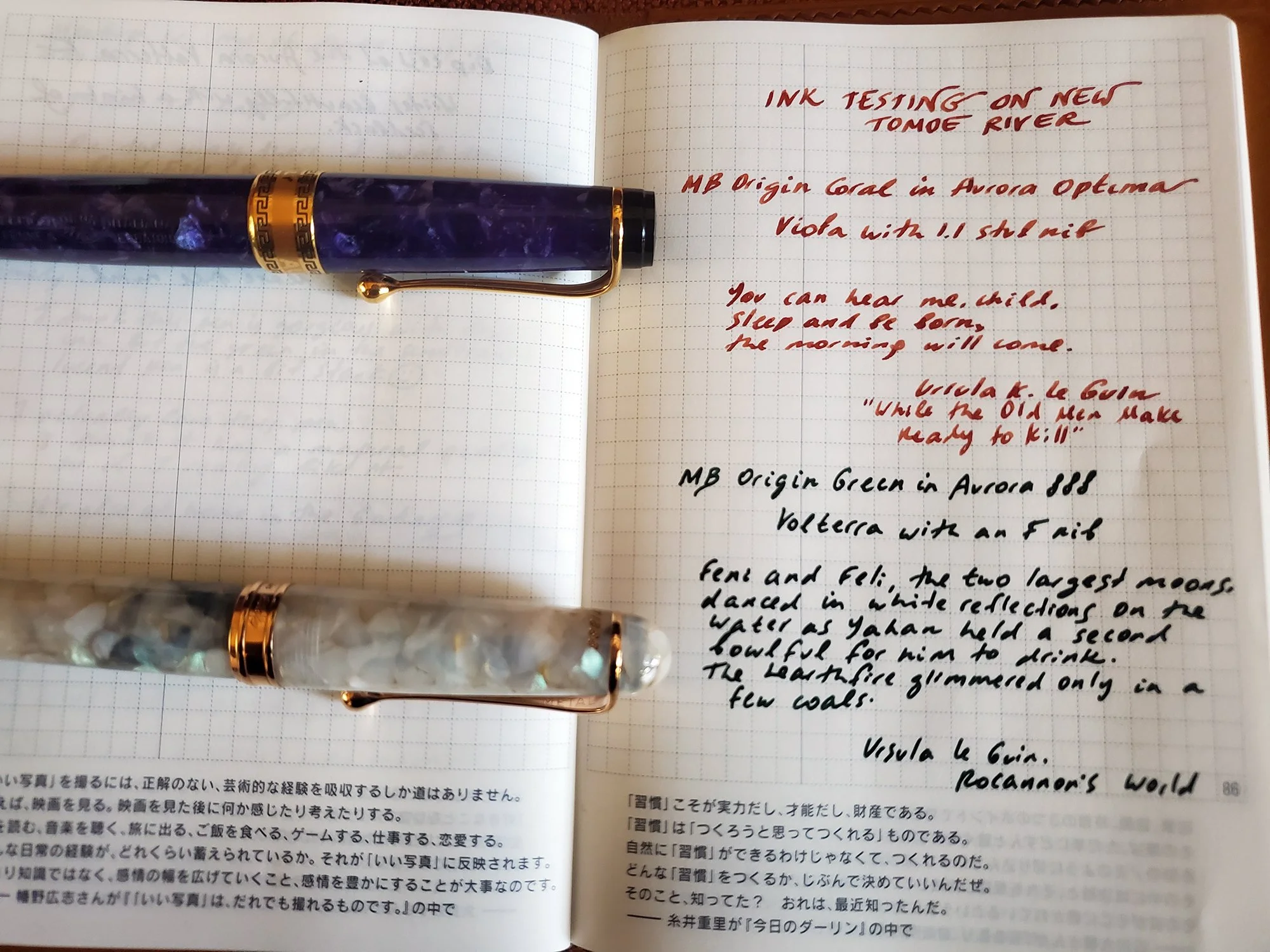
Testing both inks on new Tomoe River in my Hobonichi A6
I decided to test the GvFC situation versus the Montblanc Origin a bit more, using a dip pen and the new Aurora Volterra.

Top of the page GvFC Moss Green, bottom of the page: Montblanc Origin Green
-RB’s ink ditty of the day-
A flabbergasted unicorn
leapt over the quick brown fox.
The quick brown fox was weirded out
and ordered whiskey on the rocks.
The lazy dog is still right there
and waiting for the fox.
Here is what I thought after comparing the two: Montblanc Origin Green is darker, but this is less clear when comparing between a dip pen (which tends to be more wet, especially in the beginning) and a nib; perhaps these two inks are more similar in finer nibs than they are on a swatch. I prefer the flow of MB Origin Green, and I prefer it overall. I quite love it.
Time for some Ink Dragons

What am I looking for, when I’m adding an ink to my library?
I’ve been wondering about this quite a bit as I went off the rails set aside my ink guardrails for the year. Would I buy everything in sight, or would I be as slow and thoughtful as I am with guardrails? It’s actually too early to tell. I could in principle stop at ten bottles and not add any more. I could do silly things. Lots of time left still, and I’m curious where the year will lead me.
But I definitely have a process. I know what I’m looking for. A feeling of belonging in the context of my curation; harmonious fit; beauty, of course. A sense of subtle lyricism. In inks, a good flow, a feeling I often describe as “plush.” A beautiful glass bottle.
My two new Montblanc Origin inks are a beautiful fit.

More of the dragons, just because I can